Path:![]()
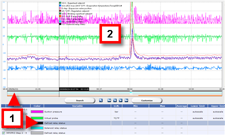
![]() , Global, HACCP graph page or log graph page
, Global, HACCP graph page or log graph page
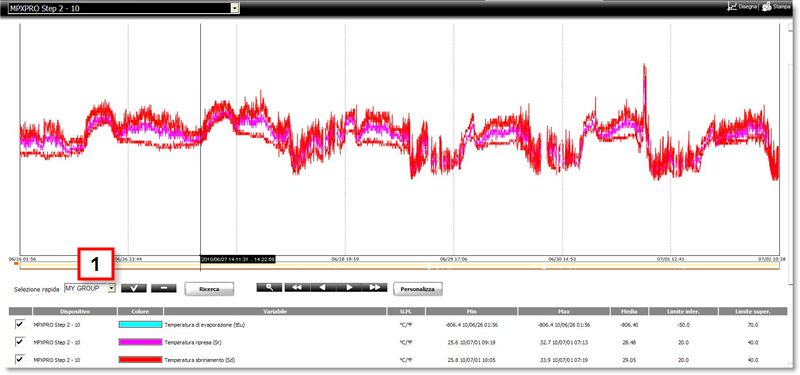
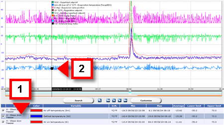
![]() , Global, double-click a device, HACCP graph page or Log graph page
, Global, double-click a device, HACCP graph page or Log graph page
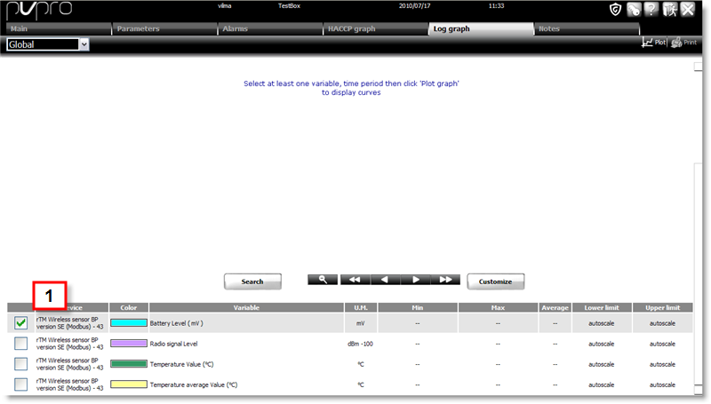
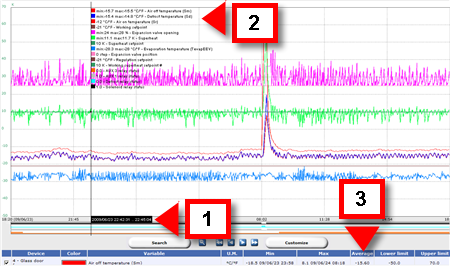
![]() , Devices, double-click a device, HACCP graph page or Log graph page
, Devices, double-click a device, HACCP graph page or Log graph page
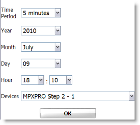
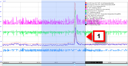
 to load the graph